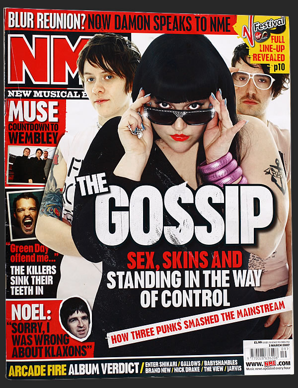
This is a front cover of rolling stone magazine which is widely known amoungst every types of audiences as rolling stones has derived from the band called rolling stone an iconic rock band wih generations of hits.
The main image consists of the "Jonas Brothers". The composition of the image of them three is that they are placed in a way that they take up the whole front cover with one member Joe placed at the centre. The reason for this type if composition could be that they're appealing amoungst young audiences especially amoungst teen girls so placing them all over the front cover would be eye catching and appealing. Joe is placed in the middle as it signifies hes the lead of the band as his role within the band is as the singer.
Thier clothing is simple yet sophisticated through there naked layer of jewellery and white shirts with brown leather jackets. This simplicity creates less attention on thier clothing but more on there facial expressions and poses. The type of clothing is very masculine and it connects with the main title which says "from boys to men" connoting that they want to be taken more seriosly as artists towards the older generations as they're maturing aswell. This type of technique is useful as it would also appeal to a wider range of audiences adding to thier promotional values.
The main title "from boys to men" is in large yellow font makng it seem prodominantly in your face as the use of yellow is very bright and eye catching so the first thing the reader notices woud be that title and they can associate the title with the main imaging. Ther is also extra wording on the side of the magazine and these are called additional sell lines. They have these as it expressed what else is contained in the magazine so audiences who arent passionate about the jonas brothers could also examine into ther artists works. If they werent there it would cause a confusion as to if the magazine was ony about the focused band at the front or not. Yet again the additional self line are also yellow adding to the continuous colour scheme giving the magazine a memorable imaging.